OOlubukola Akanbi ← Back to work
Usability Testing · Eye Tracking

Testing a housing site through a tenant's eyes.

The Housing Authority of Baltimore City (HABC) website is a gateway to housing for some of the city's most vulnerable residents. I led an eye-tracking usability study to evaluate it from a tenant's perspective — moderating sessions with eight participants to find exactly where the experience broke down.

Client

Housing Authority of Baltimore City

Role

UX researcher, moderator & eye-tracker operator

Methods

Usability testing, eye tracking, pre-test interviews

Lab

University of Baltimore Usability Lab

Context

A site that has to work for the people who need housing most.

HABC.org is where Baltimore residents go to learn about and apply for housing assistance. If a tenant can't find or understand what they need, the cost isn't a lost sale — it's a barrier to a home.

My goal was to validate the usability of the website for real users: could a prospective tenant accomplish the tasks they came to do? I evaluated the site specifically from the tenant's standpoint, working alongside three teammates — two UX designers and a graphic designer — while I owned the research, moderation, and eye-tracker operation.

Process

From task goals to a tested, evidence-backed report.

I built the study from the ground up — defining what tenants come to do, scripting realistic tasks, recruiting real participants, and running moderated sessions with eye-tracking.

1

Task goals

Explored the HABC site map to map its interface, components, and users — then identified a tenant's real goals on HABC.org.

2

Task script & scenarios

Wrote user scenarios suited to testing and piloted the script to reduce ambiguity and confusion.

3

Recruiting

Recruited potential HABC tenants via Craigslist, coordinating by text and email to bring them into the lab.

4

Pre-test interviews

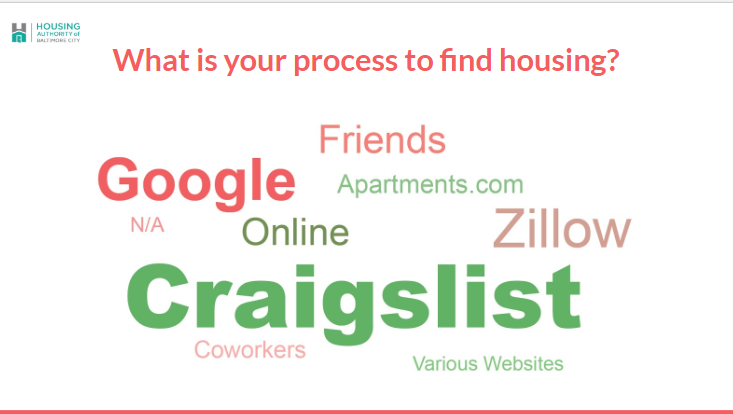
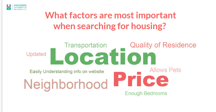
Face-to-face questions on each participant's housing process and their first impressions of the site's components.

5

Moderated testing + eye tracking

I operated the eye tracker and moderated each session at the University of Baltimore Usability Lab.

6

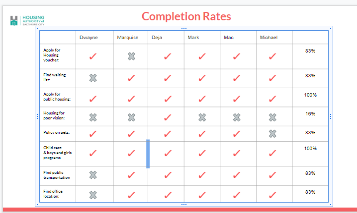
Analysis & reporting

Analysed the session data and reported findings and recommendations to the team and stakeholders.

Pre-test interview results — participants' process to find housing
Pre-test: how participants find housing
Pre-test interview results — factors most important when searching for housing
Pre-test: what matters most in their search
8Participants moderated
8Tasks per participant
2Pre-test housing questions
3Roles I held in one study
The key insight

An acronym stood between tenants and a housing voucher.

One task asked participants to apply for a housing voucher. The path ran through a label most of them didn't recognise: "HCVP."

HCVP?

Unfamiliar — and quickly forgotten

Most participants didn't know the acronym stood for the Housing Choice Voucher Program. Even after learning what it meant, they had typically forgotten it again by the end of the session. A single piece of unexplained jargon was blocking a core task.

Finding: the HCVP acronym was unfamiliar to most participants
Problem 1 — the HCVP acronym

"How well we communicate is determined not by how well we say things, but by how well we are understood."

That principle framed the whole study. The site wasn't broken visually — it was clean and consistent — but in the places that mattered most, it wasn't being understood.

Major findings

Where the experience broke down.

Across the eight tasks and the eye-tracking data, a clear set of issues emerged — alongside genuine strengths worth keeping.

Oversized hero images

Large images took up valuable space on key pages, pushing important information down and creating a barrier of entry.

Hidden disability housing

Housing choices for people with impairments or disabilities were not obvious on the site — easy to miss for the people who need them.

Misleading search bar

A misleading statement in the search bar set the wrong expectation for what users would find.

Slow information guide

The information guide took longer than expected to load, interrupting users mid-task.

What worked

Participants confirmed the site is clean, concise, and largely uniform — a solid foundation with relatively few issues to build on.

Task completion rates across the eight tasks
Task completion rates
Completion time and usability metrics from the sessions
Completion time & usability metrics
Recommendations

Clearer words, clearer space, clearer purpose.

I translated the findings into concrete, prioritised recommendations the team could act on.

Rename "HCVP" to clarify its content — e.g. "Housing Choice Vouchers" — so the label explains itself.

Create a dedicated information-guide tab, or integrate its key points into the relevant tabs across the site.

Use smaller hero images and headings on the start page to better use the space for information.

Rename the "Doing Business" tab, since its content isn't relevant to many users.

State HABC's core business and purpose prominently on the home page.

Surface disability housing — information on housing choices for people with disabilities should be far more clearly stated.

Reflection

The takeaway.

A visually clean site can still fail its users when the language and layout get in the way of understanding. By testing with real prospective tenants and watching where their attention actually went, the study turned vague impressions into a clear, actionable roadmap.

"How well we communicate is determined not by how well we say things, but how well we are understood."

Guiding principle of the study

What I'd do next

The natural follow-up is to implement the renaming and layout changes, then re-test the same core tasks with a fresh group to confirm the comprehension and findability gains — closing the loop from evidence to measured improvement.